Change is Good!
For 2014, I told myself I wouldn’t resist change, but I would embrace it. Well, it looks like I went a bit overboard!
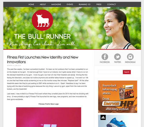
Tonight I am launching the new The Bull Runner logo and TheBullRunner.com layout.
This is the first redesign of the TBR logo ever since I designed the original identity on a whim, in 15 minutes, when I created this blog. I thought it was about time that I made it look more contemporary, strong and simple, yet striking.
As for the layout, I believe this redesign comes after over 3 years using the old layout which I felt was cluttered and confusing (much like my life then! LOL) Every year, I would dream of creating a new fresh look, but life always got in the way. This time, I committed to working on the design bit by bit whenever I had spare time from work or training (i.e., on long flights, while waiting at doctor’s clinics, sitting in the car in traffic). With the help of my fantastic web designers (and TBR Dream Alum, mind you) Marc and Gail Villanueva of Intuitiv Solutions and Cres Yulo who shot my photo in all of 15 minutes right in her condo, I was finally able to launch this little part of me on the world wide web. Thank you Marc, Gail, and Cres!
For this year, I have bigger and more exciting plans! Hope you can join the journey with me!
What do you think about the new layout? Any new topics, articles, or features you’d like to see on running? Just let me know!


